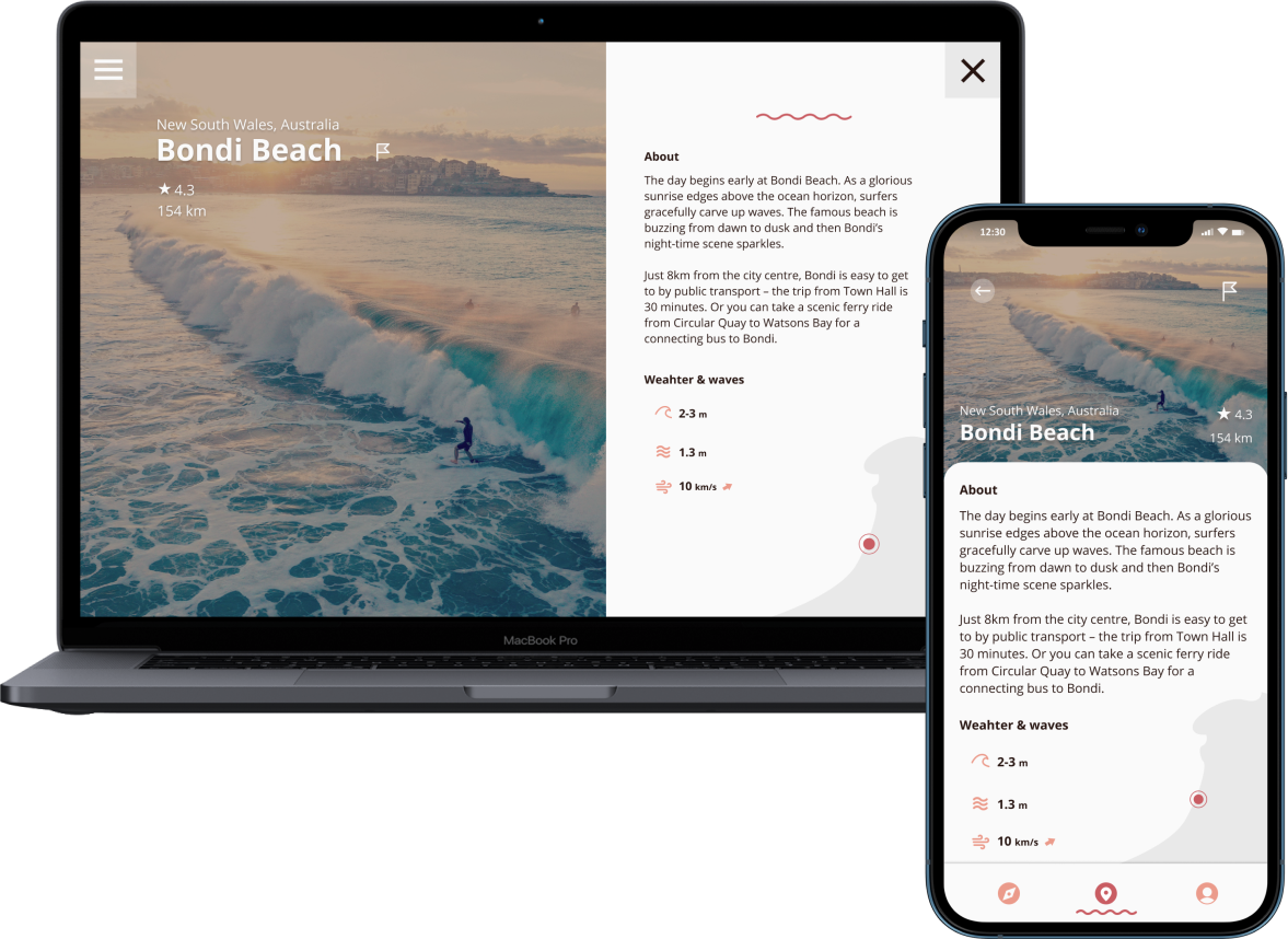
Surfers of all experience levels need an easy way to check the ‘quality’ of weather conditions, because they want to be able to quickly detect the best spots and times to go surf. The aim of this project was to create a web-app that provides surfers with all the necessary tools to plan that day on the water, and more. A community that inspires and connects like-minded surfers.
My role: UX & UI Designer
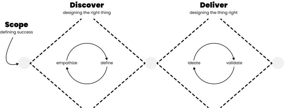
The process.
Empathize.
What I aim for in the Discover phase is a good understanding of the needs and desires of the most important user segments. A distinction between functional requirements (what tasks the user wants to complete) and emotional requirements (what motivates and frustrates the user).
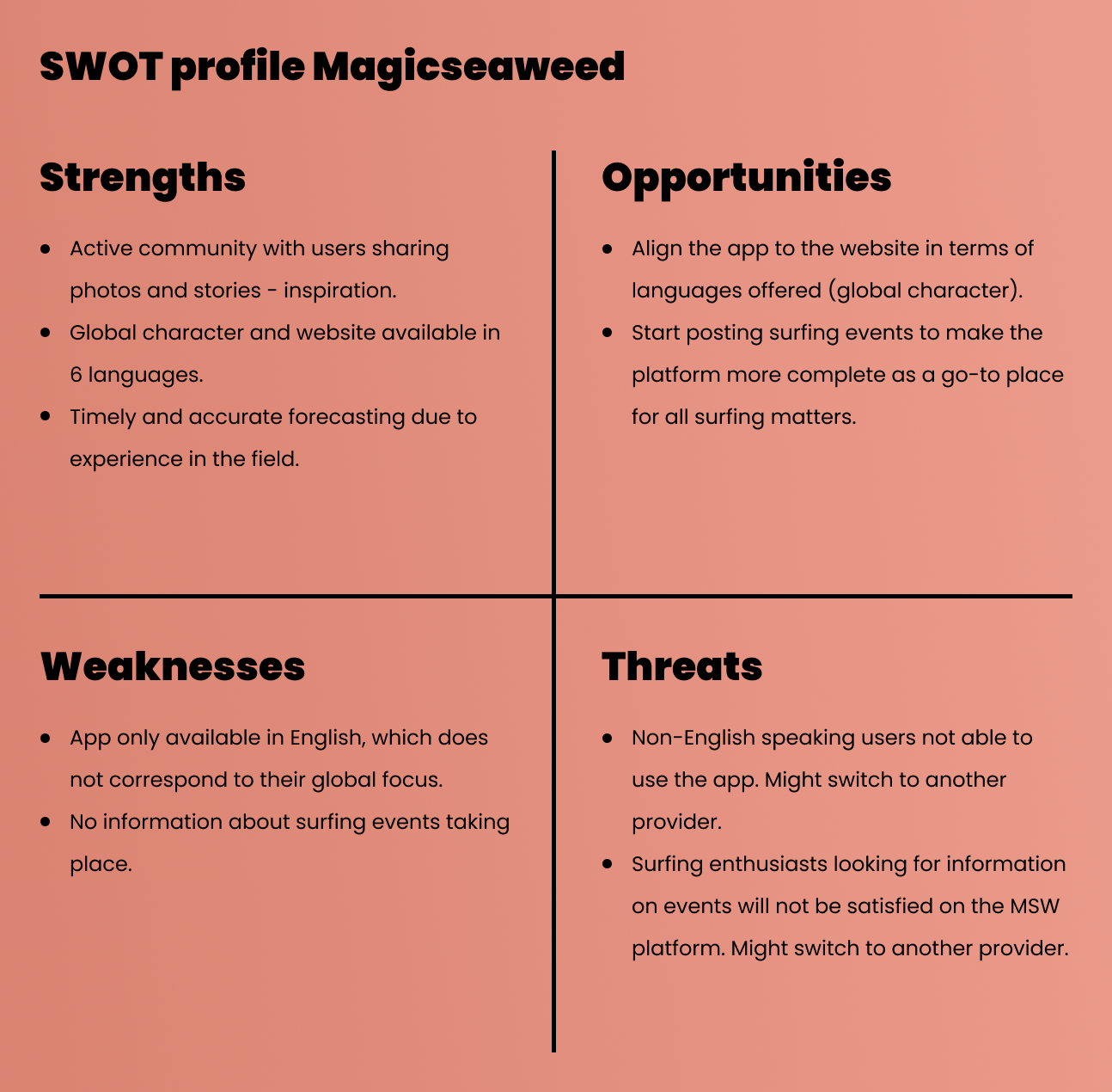
Competitive analysis
Various existing apps already target the surfing community. Such as Magicseaweed, Windy and Sine. They have established a large user base and can provide detailed and up-to-date reports for different surf spots around the globe.
Yet each competitor faces challenges – opportunities for Vela to add value. Magicseaweed’s app, for example, contains several usability flaws. And Windy has no onboarding system in place, even though their maps are quite hard to read for someone who’s not used to the interface.
Strong usability and navigation, as well as a great onboarding experience, could set Vela apart from its competition.
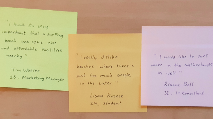
User interviews
The primary goal was to find out what information our target group needs and why/when/where they need it.
The most relevant data for the interviewees is related to tides, wave height and wind direction. It’s not really hard for them to understand the information provided by the tools they use, yet they claim that it takes a bit of getting used to. None of the interviewees had seen an onboarding tour before, affirming my assumption that this could be an interesting feature to explore for Vela.
A big factor in whether a surf session was seen as a success seemed to be how crowded the water is with other people. I underlined this frustration because I hadn’t seen competing surf apps addressing this issue.
The respondents wanted to waste as little effort as possible to find nearby surf spots when on holiday. And getting a drink or some food after a surf session is an important part of their experience. Close proximity to nearby food & beverage services is a plus, as well as nearby sanitary- and parking facilities.
Card sorting
To ensure the user’s mental model was taken into account when working on the information architecture of Vela, I conducted (open) card sorting sessions.
Four different content groups could be distinguished: 1) topics related to surf spots and nearby facilities. 2) topics related to weather and wave conditions. 3) topics related to user profiles, including profile settings and user shares. 4) topics related to the app itself and its settings.
Define.
I synthesize what I’ve learned, look for patterns and important insights and define various problems I can solve for the user. This was done by creating persona’s, journey maps, taks flows and a sitemap.
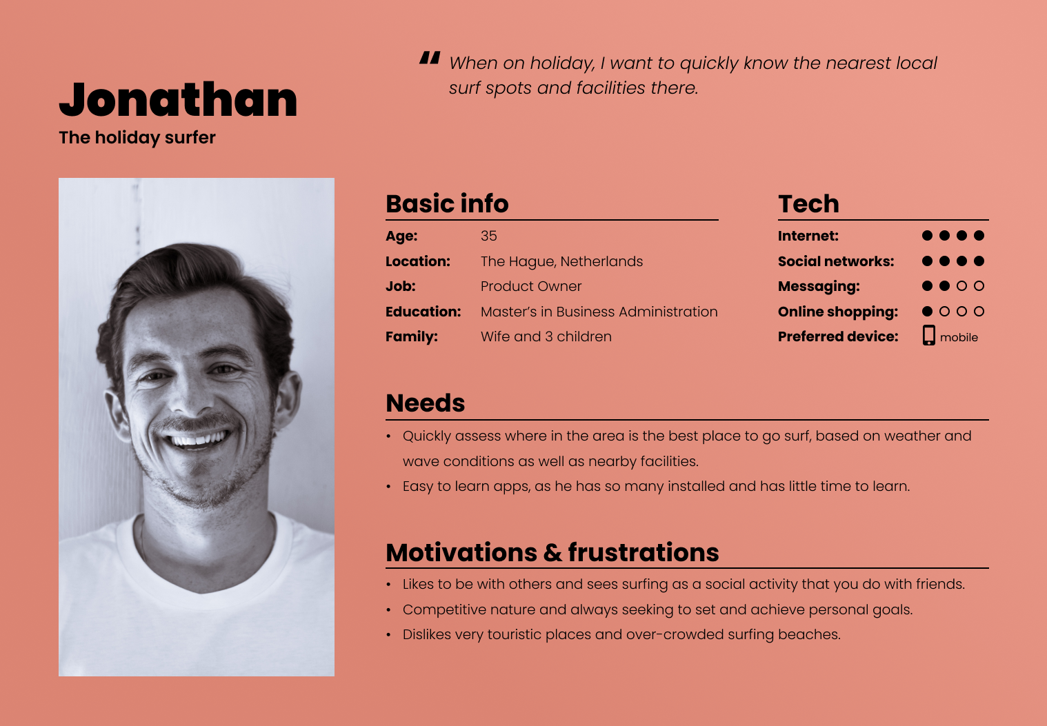
Persona’s
To summarize what defines our most important user segments, I created user persona’s. Largely based on data gathered during user interviews and some of the details were added based on my personal knowledge about the surfing community.
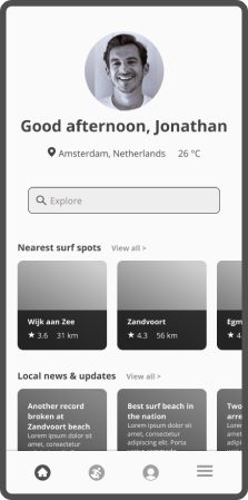
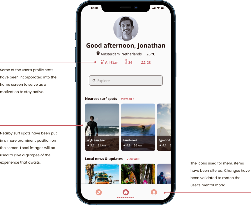
One of the persona’s is Jonathan, ‘the holiday surfer’. Jonathan values his time and needs an easy way to check what the surf conditions will be on beaches closeby, while also being able to assess if it will be a good place to bring his kids (facility-wise). These are all requirements to take into account further down the design process.
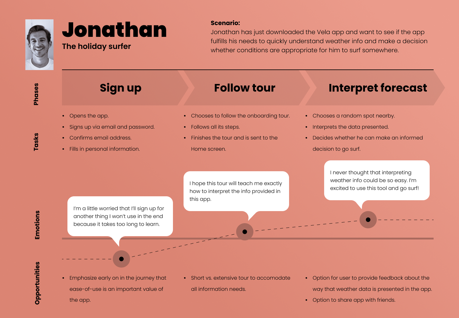
User journeys
I created journey maps for each of the persona’s. It directed the focus on not only on who the persona’s represent, but what goals, habits and behaviors they exhibit in reference to the project. It helped to bring the broader context to life.
For Jonathan – who wants to easily digest the right weather information – the journey map illustrates the importance of a strong onboarding experience.
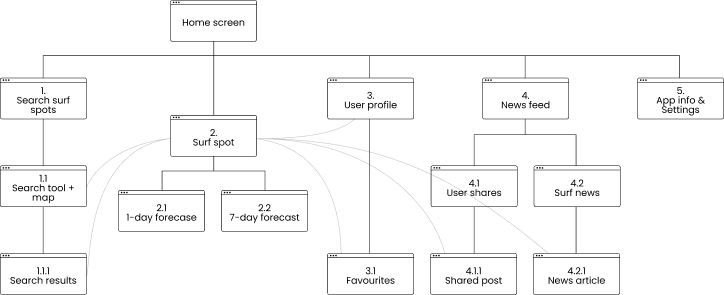
Sitemap
I created user flows for specific goals a persona would aim to achieve, tasks they’d want to complete with Vela. These flows – along with the card sorting results already collected – formed the basis for a sitemap. It showed visually how different features would be accessible and connected.
Ideate.
After forming an understanding of the users’ needs and desires, I start to think about solutions. The Deliver phase is all about designing the thing right. Which means that we start by collecting many different ideas to solve the problem and start testing them as soon as possible.
Stimulating creativity during ideation is key to success. Ideation should always be interactive and collaborative, where all possible solutions are explored and everyone gets their say. That said, for this project I acted on my own so I had to be the single voice of reason 🙂
Validate.
Which ideas will bring the most value? How will they work? In order to bring our ideas to live we needed to visualize them and provide an option to test their effectiveness on actual users.
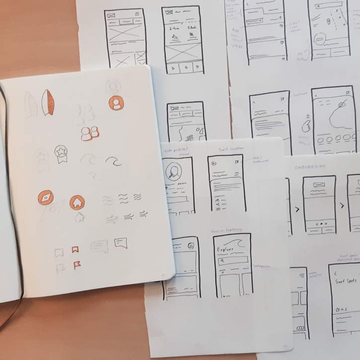
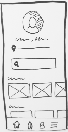
Early prototypes
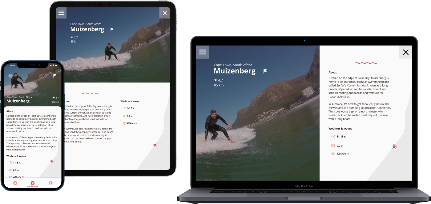
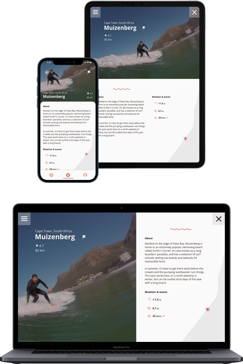
Paper sketches were made dynamic by connecting screens and providing notes on the operation of the presented features. The first digital interactive prototypes were made in Figma and could be tested by anyone I shared the link with.
Usability testing
I wanted to find out whether Vela was solving our user’s problems, by being both useful and usable. Test participants had to go through some of the more important app features.
I used InVision’s prototyping share feature to gather screen-specific user feedback. Participants for these remote usability tests were recruited via Slack channels. I also conducted moderated, in-person tests to be able to delve a bit deeper into the user’s mind at certain points in the user journey.
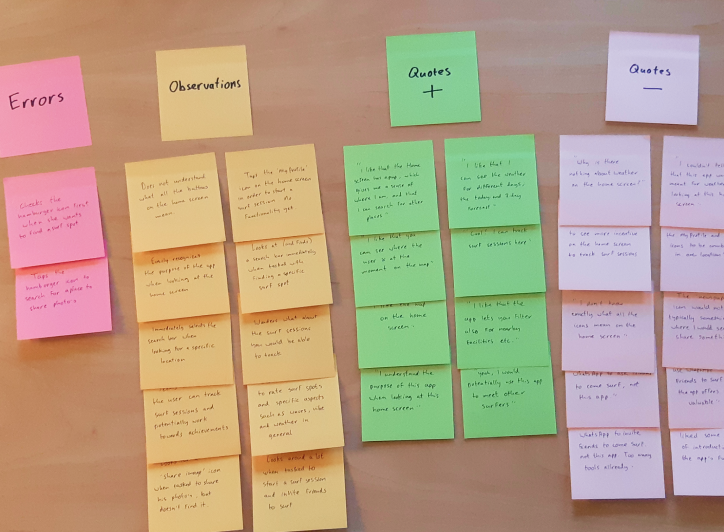
An affinity map was created in order to define and group specific test-findings. I prioritized them in order to lay focus to the most pressing design issues.
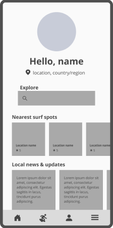
Refining the design
Several screen UI’s and components were reshaped based on the insights from usability testing. High-fidelity prototypes were created in Figma itself, more complex shapes in Illustrator.
The end product was a pixel perfect interactive clickable prototype in Figma, along with clearly defined components and style guide.